Legacy of the Montblanc Meisterstück 149 (Overview of Montblanc 149 Pens)
149 fountain pen, a true symbol of elegance and craftsmanship. Renowned for its distinctive design and exceptional writing experience, the Montblanc 149 has become a favorite among collectors and enthusiasts alike. From special collaborations to commemorative editions, the Montblanc 149 has seen numerous transformations. Montblanc 149 special and limited editions Year Name of pen Limitation..
149 fountain pen, a true symbol of elegance and craftsmanship. Renowned for its distinctive design and exceptional writing experience, the Montblanc 149 has become a favorite among collectors and enthusiasts alike. From special collaborations to commemorative editions, the Montblanc 149 has seen numerous transformations.
Montblanc 149 special and limited editions
| Year | Name of pen | Limitation | Nib | Ref. number | Note |
|---|---|---|---|---|---|
| 1952 | Montblanc 149 | — | 3-tone, 14K | — | 149 Celluloid |
| 1970s | GARRARD 149 Khanjar | 50 | 2-tone, 14K | 149/OMD | Order of Oman Ministry of Defense |
| 1970s | Arabic | — | 2-tone, 14K | — | Triangle on top of cap |
| 1980s | Mont dot | — | — | — | Circle on top of cap |
| 1980s | Solid gold | < 1000 | 2-tone, 18K | M149G | — |
| 1980s | Chevron | < 20 | 2-tone, 18K | 1499 | SE handmade for Tiffany |
| 1990 | Solid gold Pinstriped | ? | 2-tone, 18K | — | — |
| 1990 | Solid platinum | ? | 2-tone, 18K | — | — |
| 1990–present | Demonstrator | Boutique | 3-tone, 14K / 18K | — | Not for sale |
| 1999 | 75th Anniversary | — | 2-tone, 18K, special anniversary design | 75350 | Cap engraving: “75 YEARS OF PASSION AND SOUL” |
| 1999 | 75th Anniversary 1924 | 1924 | 2-tone, 18K, special anniversary design | 75200 | Cap engraving: “75 YEARS OF PASSION AND SOUL” |
| 1999 | 75th Anniversary Helmut Newton | 75 | 2-tone, 18K, special anniversary design | 10575 | Helmut Newton signature |
| 1999 | 75th Anniversary Skeleton | 75 | 18K gold, special anniversary design | 75100 | — |
| 2001 | Skeleton 333 | 333 | Rhodium-plated gold nib | 33349 | — |
| 2002 | John Harrison Skeleton | 333 | 18K gold nib engraved with portrait of John Harrison | ? | — |
| 2002 | John Harrison Skeleton prototype | 1 | Steel nib with jeep | — | Gift from Montblanc to the ex CTO |
| 2003 | I Love Hong Kong | 33 | 18K gold nib engraved with “bauhinia” | ? | — |
| 2004 | Teatro alla Scala | 2004 | 3-tone, 18K | 35718 | Gilt logo of the theatre on cap |
| 2004 | Unicef Tom Sachs | 4810 | 3-tone, 18K | 35030 | — |
| 2004 | Unicef Andrée Putman | 4810 | 3-tone, 18K | 35035 | — |
| 2004 | Unicef Helmut Jahn | 4810 | 3-tone, 18K | 35031 | — |
| 2007 | Unicef S.R. Nathan | 149 | 3-tone, 18K | ? | S.R. Nathan signature |
| 2008 | The Fortune Number Skeleton | 88 | 18K rose gold nib engraved with Yin Yang figure | MB104228 | — |
| 2009 | Barack Obama – Yes We Can | 100 | 3-tone, 18K | MS1524837 | “Yes, We Can” in Obama’s own cursive |
| 2010 | Aeroplane Skeleton | 380 | 18K gold nib with platinum-plated finish, A380 design | 38948 | — |
| 2014 | 90th Anniversary Skeleton | 90 | 18K red gold nib, special 90 years design | MB111849 | — |
| 2014 | 90th Anniversary | — | 18K rose gold nib, special 90 years design | MB111062 | — |
| 2014 | Cinema of Peace Berlin – Mauerfall | 149 | 18K rose gold, Brandenburg Gate with encircled “25” | ? | — |
| 2015 | Blue Hour Skeleton | 500 | 18K white gold, special Blue Hour engraving | MB113035 | — |
| 2015 | Taipei 101 | 101 | 18K red gold, Taipei design | ? | — |
| 2016 | BMW Centennial Skeleton | 100 | 18K rhodium-plated, engraved with BMW “7” | ? | Available to buyers of BMW Individual 7 |
| 2016 | Hamburg | ? | 18K rhodium-plated, emblem of Hamburg Civil Flag | MB115239 | — |
| 2017 | Happy Circus – Greatest Showman | Prototype | 18K rose gold, with ruby and circus design | — | — |
| 2017 | Elbphilharmonie | 300 | 18K red gold, 2-tone with Elbphilharmonie design | MB116556 | — |
| 2017 | Unicef Skeleton | 500 | 18K white gold, special signs design | MB115981 | — |
| 2019 | Calligraphy Flexible Nib | — | 18K solid gold nib, flexible line | MB119699 | — |
| 2020 | Fritz Schimpf Edge Italic | 100 | 3-tone, 18K gold nib, state-of-the-art nib face | — | — |
| 2020 | Fritz Schimpf Expressive | 80 | 18K gold nib, custom designed italic flex nib | — | — |
| 2020 | Kingsman | — | 18K gold nib engraved with Kingsman logo | MB127417 | Set |
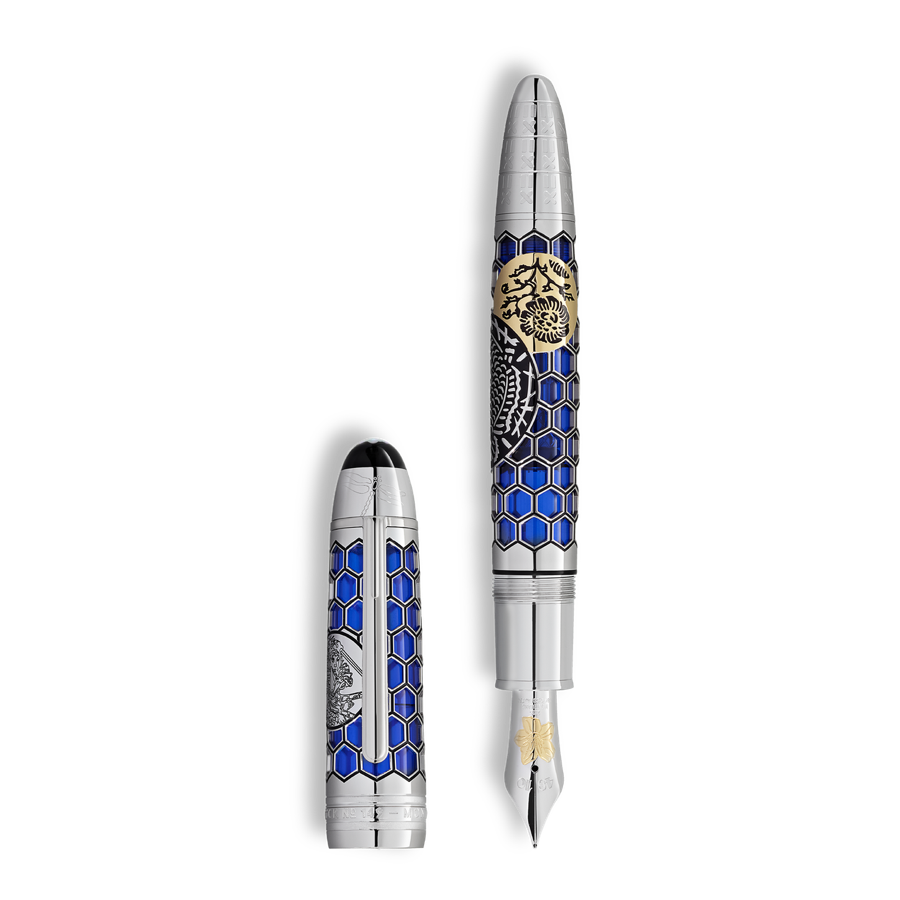
| 2021 | Great Wall of China | 333 | Yellow gold engraving of a tower | MB126982 | High Artistry |
| 2023 | Calligraphy Curved Nib | — | 18K solid gold, three delicate parallel lines | MB129275 | — |
| 2023 | High Artistry Orient Express 1883 | 1883 | Gold nib based on design from Prou’s marquetry works | MB130689 | With coffret set |
| 2023 | High Artistry Orient Express 333 | 333 | Solid gold 18K, bouquet of flowers, homage to René Prou | MB129350 | — |
| 2023 | High Artistry – The First Ascent of the Mont Blanc | 333 | Rhodium-coated, edelweiss flower | MB127023 | — |
| 2024 | Origin 100th Anniversary | — | Rhodium-coated solid gold nib, 100th anniversary design | MB131336 | — |
| 2024 | Traveller 1924 | 1924 | Solid Signature gold 18K, 100th anniversary design | MB130327 | Innovation with a new filling mechanism |
| 2024 | High Artistry The Origin Collection LE | 100 | Solid gold 18K with green tsavorite, 100th anniversary design | MB131357 | — |
| 2024 | High Artistry Inspire Calligraphy | 88 | White gold italic nib, 100th anniversary design | — | — |
| 2024 | High Artistry – The World of Cinema | 333 | 2-tone, 18K gold nib with cinema design | MB127963 | — |
| 2025 | Burgundy red | – | 2-tone, 18K rose gold nib | MB136757 | — |
| 2026 | Meisterstück Style of Zug Special Edition | 500 (not numbered) | 18K gold nib Style of Zug design | – | Grey-blue glacier color |
| 2026 | High Artistry A Tribute to Craftsmanship Limited Edition 1994 Coffret | 1994 | Solid Au 750 gold nib with Sakura-inspired special embossing | MB132042 | Vermilion precious resin coffret with crane motif; inspired by Kyoto UNESCO heritage. |
| 2026 | High Artistry A Tribute to Craftsmanship Limited Edition 333 Fountain Pen | 333 | Solid Au 750 gold nib with special embossing | MB131146 | A more restricted High Artistry fountain-pen edition in the same Tribute to Craftsmanship chapter. |
History of Montblanc 149
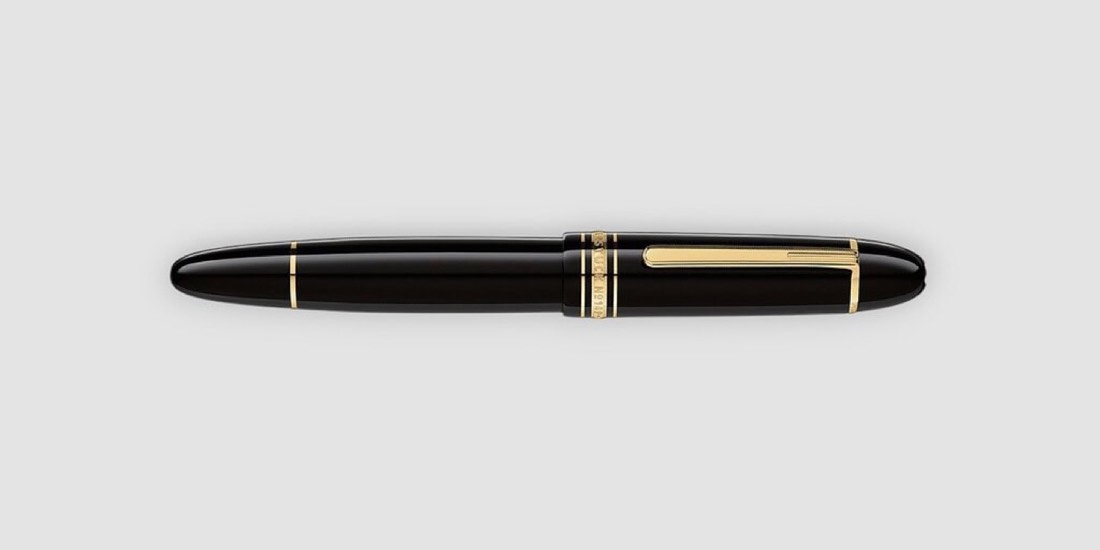
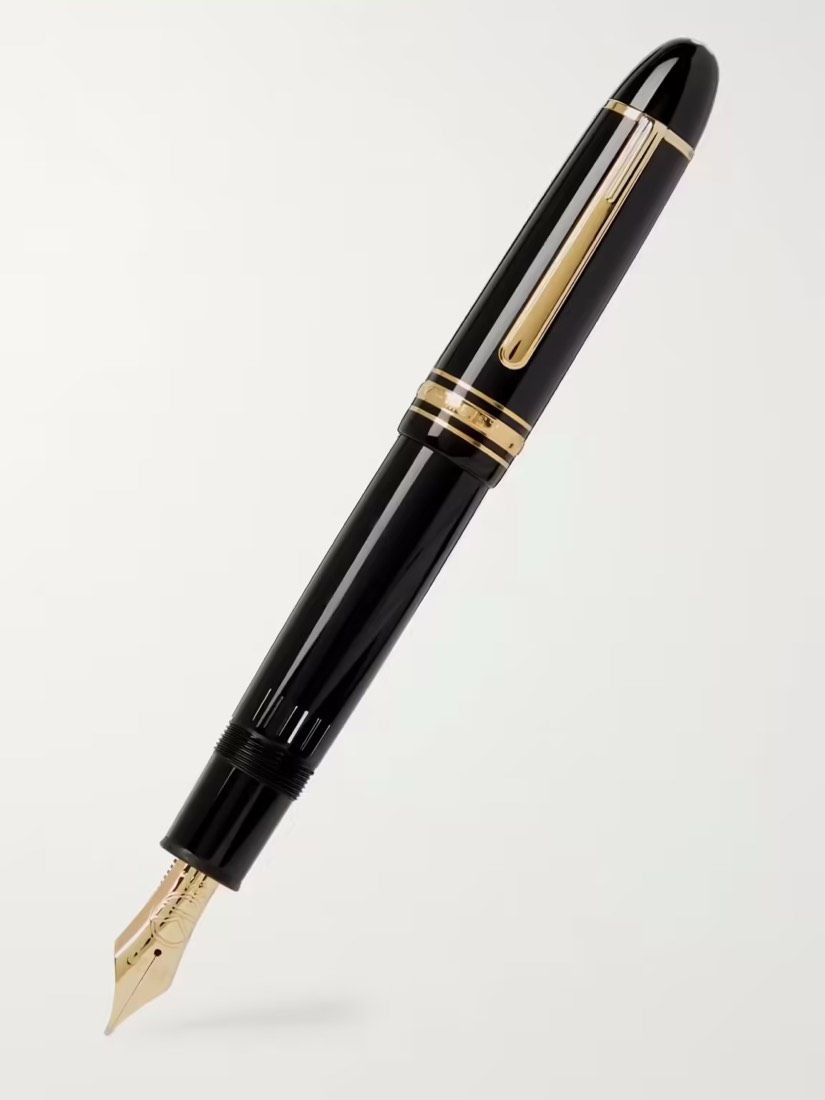
The Montblanc Meisterstück 149, often considered the crown jewel of luxury fountain pens, has a storied history dating back to its inception in 1952. It has undergone various evolutions over the decades, both in terms of materials and design, while retaining its classic aesthetic. Here is a detailed history of this iconic pen:
1952: Introduction of the Montblanc 149
- The Montblanc Meisterstück 149 was introduced in 1952 as part of Montblanc’s Meisterstück (Masterpiece) line, which had been established in 1924.
- The 149 model was meant to be a high-end, large-sized fountain pen, offering an elevated writing experience.
- It featured a distinctive cigar-shaped design, which remains largely unchanged today.
- The original model came with a celluloid body, a material popular at the time for its durability and sheen.
- The pen used a piston-filling mechanism, allowing for a large ink capacity—ideal for those who wrote extensively.
1960s–1970s: Evolution of Design and Materials
- In the 1960s, Montblanc began using a newer synthetic resin for the body, replacing the original celluloid. This material, known for its resilience, became a hallmark of the brand.
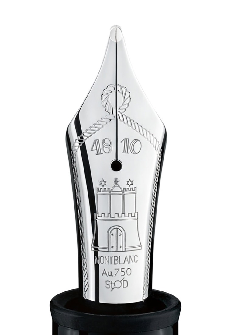
- The 18-karat gold nib (originally 14-karat) featured intricate engravings, and it was designed for smooth and flexible writing.
- The cap of the pen displayed Montblanc’s signature white star, representing the snow-covered peak of Mont Blanc, the highest mountain in the Alps.
- During this time, the ink view window became a standard feature, allowing users to see how much ink remained in the pen.
1980s: Rise of the 149 as a Status Symbol
- In the 1980s, the Montblanc 149 began to be recognized not only as a writing instrument but also as a status symbol among executives, collectors, and writing enthusiasts.
- The pen was marketed more aggressively as a luxury item, emphasizing its heritage and craftsmanship.
- This decade also saw some refinements in the design, such as a slightly sleeker body and updates to the nib’s design.
1990s: Introduction of the Platinum-Coated Series
- The 1990s brought the introduction of the platinum-coated versions of the Meisterstück 149, expanding the line to include options that paired classic design with a modern twist.
- These models featured platinum accents instead of the traditional gold-plated ones, offering a different aesthetic for collectors.
- The piston mechanism was further refined during this period, ensuring smoother operation and more precise control over ink flow.
2000s: Continuous Refinement and the Tribute to Montblanc
- Montblanc continued to refine the internal mechanics and quality of materials used in the 149 throughout the early 2000s, emphasizing the pen’s craftsmanship and long-lasting durability.
- Special editions and limited editions of the 149 were released, often celebrating milestones or paying tribute to famous writers and historical figures.
- These versions maintained the core design but featured unique engravings, precious metal overlays, or other embellishments.
2010s: Special Editions
- In the 2010s, the Montblanc 149 continued to be a symbol of prestige, with Montblanc celebrating its heritage through various special editions.
- The company released models with solid gold nibs as well as special engravings commemorating different historical themes and anniversaries.
- Montblanc also offered customization options for the 149, allowing buyers to personalize the pen with initials or special designs.
- During this time, the pen’s piston-filling system became even more efficient, and the nib sizes ranged from extra fine to O3B, allowing writers to choose according to their preferences.
2020s: Innovations and Sustainability
- Montblanc has been increasingly mindful of sustainability and the environmental impact of its products in the 2020s. While still dedicated to traditional craftsmanship, the company has looked for ways to innovate and reduce its ecological footprint.
- The Montblanc 149 remains a flagship product, still made with the same dedication to quality that has defined it for over 70 years.
- Collectors today can find limited editions that celebrate not just historical events but also Montblanc’s own legacy as a maker of fine writing instruments.
- The 149 continues to appeal to a global audience, blending the brand’s deep-rooted tradition with a modern appreciation for luxury and craftsmanship.
Design Features That Have Remained Consistent
Throughout its history, certain design elements of the Montblanc 149 have remained consistent, contributing to its timeless appeal:
- Signature Cigar Shape: The large, rounded body of the pen has a balanced, ergonomic feel, designed for long writing sessions.
- White Star Logo: The Montblanc emblem on the cap top symbolizes the snow-capped peak of Mont Blanc, representing the brand’s commitment to quality and European craftsmanship.
- Hand-Crafted Nibs: The nibs of the 149 are made by skilled artisans, ensuring that each one offers a unique writing experience.
Montblanc 149 Today
The Montblanc Meisterstück 149 remains one of the most celebrated fountain pens in the world, cherished by writers, collectors, and professionals. Its combination of traditional craftsmanship and understated elegance makes it a lasting symbol of excellence in writing instruments. Whether used as a daily writing tool or as a collector’s piece, the Montblanc 149 continues to represent the pinnacle of Montblanc’s commitment to quality, precision, and timeless design.
The evolution of the Montblanc 149 from a high-quality writing instrument to an international symbol of sophistication and success is a testament to its enduring appeal and the brand’s ability to adapt while staying true to its roots.

The newest High Artistry 149 pens
Montblanc is still using the Meisterstück 149 architecture as a canvas for its most symbolic High Artistry writing instruments. The two latest additions below replace the earlier placeholder entries in the overview table and show how the 149 format continues to move between classic writing instrument, collector object and ceremonial presentation piece.
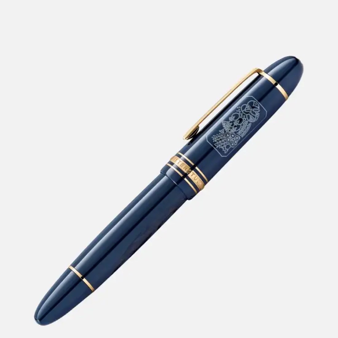
High Artistry A Tribute to Craftsmanship Limited Edition 1994 Coffret
This coffret edition is limited to 1994 pieces worldwide. Montblanc connects that number with 1994, the year when a group of Kyoto historic sites received UNESCO World Heritage status. The pen uses vermilion-coloured precious resin, black resin details, a crane motif on the cap and a handcrafted solid Au 750 gold nib with Sakura-inspired embossing.
- Limitation: 1994 pieces
- Reference: MB132042
- Key visual idea: vermilion resin, crane symbolism and Japanese craft references
High Artistry A Tribute to Craftsmanship Limited Edition 333 Fountain Pen
The Limited Edition 333 fountain pen sits in the same High Artistry A Tribute to Craftsmanship chapter, but with a tighter limitation. It belongs in the table because it is one of the newest 149-scale Montblanc limited editions and because its lower edition number makes it especially relevant for collectors tracking the modern evolution of the 149.
- Limitation: 333 pieces
- Reference: MB131146
- Collector note: the more exclusive fountain-pen edition in the latest Tribute to Craftsmanship pair
Montblanc Meisterstück 149 – evolution timeline
A condensed overview of the main technical and visual changes of the Montblanc Meisterstück 149 from the 1950s to today, based on historical component analysis (nib, feed, piston, barrel, cap and markings).
-
1952–late 1950s Celluloid & telescopic piston era L139–style nibs, 14C tri-tone
- Celluloid barrel with separate section, early “telescopic” (two-stage) piston with cork seal.
- Flat ebonite feed variants (no grooves → 2 grooves → 4-groove type).
- 14C tri-tone nibs, very soft, early pieces even use L139-marked nibs.
- Green ink window, early three cap rings with silver outer rings; warm, “honey” coloured white star.
- Clip without ring engraving; cap ring text sometimes “MEISTERPIECE” on export models.
-
1960s Early resin & classic telescopic piston 14C & 18C tri-tone nibs
- Transition from celluloid barrel to resin; section and barrel still separate.
- Refined telescopic piston unit, still using cork, with slightly increased ink capacity.
- 14C and 18C nibs, visually similar to 1950s but usually a bit firmer.
- Green ink window remains; cap rings now all gold-coloured.
- Clip engraving and fonts evolve (different “4” and “9” shapes, “MADE IN GERMANY” appears).
-
1970s One-piece barrel & brass piston unit Resin barrel, ebonite feed
- Barrel and section become one piece; wall thickness increases to reduce cracking.
- New non-telescopic brass piston unit replaces cork system; plastic piston head with front flare.
- Ebonite feed continues, with longitudinal grooves and longer overall length.
- Ink window now clear/transparent; overall construction more robust, fewer ink-leak issues.
- Cap ring fonts unified to “MEISTERSTUCK”; cap shape becomes more straight and less tapered.
-
1980s Two-tone nibs & modernised clip 14K / 18K 2-tone, “W-Germany”
- 14K and 18K two-tone nibs introduced; most pieces still fairly soft but firmer than 50s.
- Ebonite “split” feeds (two-step / two-tier feeds) appear, then later late-80s ebonite feed variants.
- Brass piston unit further refined; some weight changes due to machining and cost optimisation.
- Clip geometry changes – stronger angle near the top for better pocket grip.
- “W-GERMANY” engraving appears after German reunification; serial numbers still not present.
-
Early 1990s Hemingway & early resin feed All 18K nibs, first serials
- Switch to 18K nibs as standard (domestic + export unified); often referred to as “Hemingway-era” nibs.
- First resin feeds (“Hemingway feed”), still relatively short and thick.
- Brass piston unit remains; overall weight slightly increases.
- Clip engraving “W-GERMANY” with laser-etched serial numbers appears on the cap band.
- White star becomes cleaner, more neutral white vs earlier ivory tones.
-
Mid-1990s – 2000s “Dumas” feed & modern construction Resin feed (long), trumpet section
- Longer resin feed associated with the Alexandre Dumas LE (“Dumas feed”), used on standard 149s as well.
- Ink capacity reduced slightly (approx. 1.5 ml) due to internal changes but reliability improves.
- “Trumpet” section shape introduced; section and barrel technically separate but sealed.
- Piston unit lightened through machining, but still full brass; minor internal geometry tweaks.
- Laser-engraved “GERMANY” + serial number standardised; clip back later gets “Pix” mark.
-
2010–2013 Refined feed & metal/Germany Pix mark Au750 stamping
- Further evolution of the resin feed (fin count and tip engraving variations, incl. service-replacement feeds).
- “Au750” gold fineness mark added to the nib in place of older “18K” only designation.
- Clip back engraving updated to “metal GERMANY Pix”.
- Cap-top and ring interface refined for better locking and sealing.
-
2014 – present Modern serviceable 149 Screw-in nib unit, grey piston guide
- Front section becomes a true screw-in nib unit – nib and feed can be removed as a complete collar.
- Piston guide colour changes to grey; turning knob and spiral bar can be separated for service.
- Barrel and piston tolerances improved; same basic geometry as late 1990s but slightly lighter piston unit.
- Engraving updated to “MEISTERSTUCK NO 149 – Pix R –” on the cap ring.
- This is essentially the current reference construction for modern 149 pens.
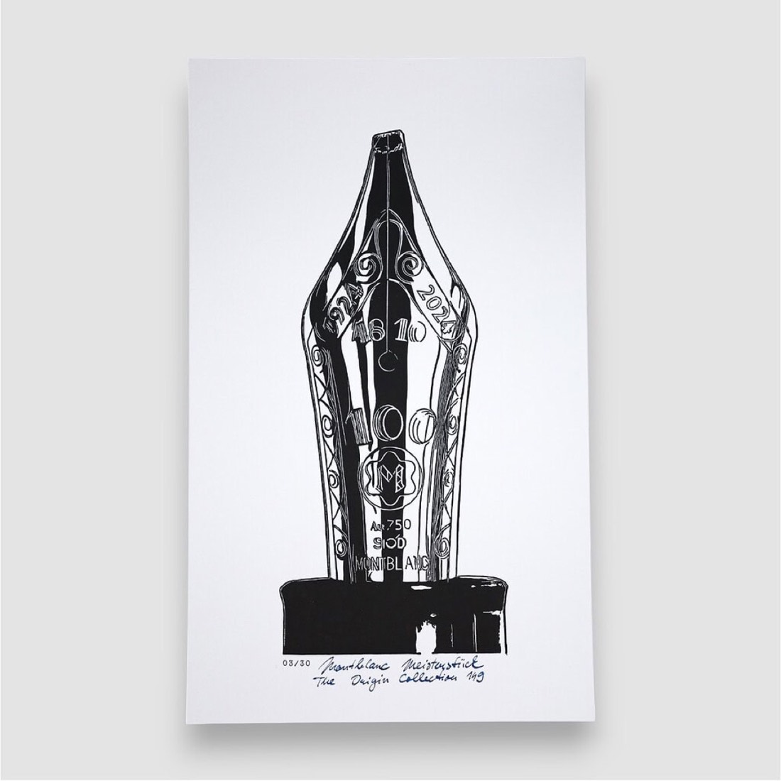
149 linocut graphics from the shop
Selected handmade linocut prints connected with the Montblanc 149. Open a piece, review the detail or add an available print directly to your cart.


0 comments
Comments are moderated before publishing, so the conversation stays useful and calm.
No comments yet. You can leave the first note below.