Seven Gods, Seven Artists, One Century: The Story Behind Pilot's 100th Anniversary Masterpieces
Seven pens, seven artists and a century of Japanese craftsmanship: the symbolism, maki-e techniques and anniversary inks behind Pilot’s Seven Gods collection.

Seven Gods, Seven Artists, One Century: The Story Behind Pilot's 100th Anniversary Masterpieces
You can lock your phone and keep listening.
Seven Fountain Pens, Seven Deities, One Century of Japanese Craftsmanship
When Pilot celebrated its 100th anniversary in 2018, it could have simply created a more luxurious version of an existing fountain pen, used a more precious material, engraved the number 100 on the nib and released another limited edition. Instead, for one of the most important milestones in its history, Pilot returned to something deeply connected to the company’s roots: the fountain pen, Japanese urushi lacquer and the art of maki-e.
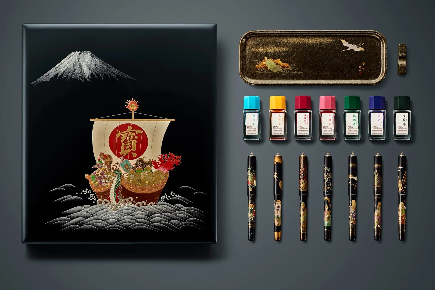
The result was the Seven Gods of Good Fortune – Shichifukujin collection, consisting of seven fountain pens, each representing one of the traditional Japanese deities of good fortune: Ebisu, Daikoku-ten, Bishamon-ten, Benzai-ten, Fuku-roku-ju, Juro-jin and Hotei-son. These were not simply seven variations of the same illustration. Each pen was created by a different artist from Kokkokai, the group of maki-e masters closely connected to the history of Pilot and Namiki, while Pilot credits eleven artisans with the complete Seven Gods presentation set, including its decorated box and pen tray. The wider centenary range was a separate, larger project.
I became the proud owner of the Hotei-son version, and that pen was the reason I started looking much more deeply into the entire collection. I did not want to understand only what was painted on my own pen. I wanted to explore all seven motifs, their symbolism, the differences between the individual artists, the techniques they used, and why Pilot chose the Seven Gods of Good Fortune for its centenary in the first place. So in this article, I do not want to focus only on Hotei-son, but to look at all seven pens as one complete collection while also treating each of them as an individual work of art.
The roots go back much further than 2018
The story of these pens does not really begin in 2018. Pilot was founded in 1918 as the Namiki Manufacturing Company by Ryosuke Namiki and Masao Wada. Namiki’s historical timeline places its work on lacquered ebonite in 1924. Urushi, the natural Japanese lacquer, initially served a practical purpose: helping the ebonite bodies resist discolouration and loss of shine.
What began as a technical solution quickly became an artistic opportunity. In 1925, the company started producing fountain pens decorated using the traditional maki-e technique, gradually transforming the surface of a fountain pen into a space for genuine artistic expression. According to Namiki’s historical timeline, orders from London already followed in 1925, a London office opened in 1926, and the agreement with Alfred Dunhill came in 1930. That partnership brought Dunhill-Namiki pens to international markets and remains, to me, one of the defining chapters in the history of maki-e fountain pens.
In 1931, the Kokkokai group was established under the leadership of master Gonroku Matsuda, who would later be designated a Japanese Living National Treasure. Its significance was not limited to creating beautiful pens. Kokkokai also helped preserve, refine and pass down maki-e techniques from one generation of artists to the next. That tradition continues today, and Namiki works still carry the signature of the individual artist or the Kokkokai name.
That is also why I do not see the Seven Gods simply as an expensive anniversary collection. To me, it feels more like a retrospective of Pilot’s first hundred years, bringing together fountain pen manufacturing, functional design, Japanese craftsmanship and an artistic tradition that has been closely tied to the company almost from the very beginning. And that is exactly why this collection makes far more sense as a centenary statement than a pen made simply from a more expensive material.
Seven paintings wrapped around seven fountain pens
On a technical level, all seven pens share the same foundation. Both the barrel and cap are made from brass and decorated using Togidashi-Taka Maki-e. Each pen measures 142 mm in length, has a maximum diameter of 14.3 mm and uses Pilot’s cartridge/converter filling system with the CON-70 converter.
The dimensions, however, are only part of the story. There are two distinct versions. The complete lacquerware presentation set, limited to 25 sets worldwide, uses clipless ringtop pens inspired by early Shōwa designs. Pilot’s original announcement scheduled this set for October 2018. To my eye, the absence of a clip makes the artwork especially easy to follow around the cap.
The individually sold pens have clips. In its February 2019 announcement, Japanese retailer Nagasawa explicitly compared the two cap designs, announced the individual pens for March 2019 and stated a maximum of 150 numbered pens per design. Buying all seven individual versions therefore does not make them one of the 25 original presentation sets.
The painting therefore does not begin or end on a single “front” side of the pen. It continues all the way around the body. If you look at a Seven Gods pen only in a single front-facing product photograph, you are really seeing only part of the story. The figure may appear on one side, its attributes on another, the landscape may continue behind the deity, and additional symbols can reveal themselves only as the pen is turned. That is why I do not think these pens should be viewed simply as decorated fountain pens. They are much closer to miniature three-dimensional paintings that need to be rotated in the hand and discovered gradually.
What exactly is Togidashi-Taka Maki-e?
To really appreciate the individual Seven Gods pens, it helps to first understand the technique used to create them. Togidashi-Taka Maki-e combines two different approaches to working with urushi. In togidashi, the completed motif is covered with additional layers of lacquer, and the surface is then carefully polished down until the image gradually reappears. In other words, the artist first creates the motif, deliberately hides it beneath further layers, and then slowly reveals it again through polishing.
In Namiki’s description of Togidashi-Taka Maki-e, the background is first finished using togidashi, then the main design is built up with materials such as lacquer and charcoal powder and finished using hira maki-e techniques. The result is therefore not simply a drawing or painting on a flat surface. Individual elements have real relief and depth. Clothing, ornaments, objects or parts of a figure can rise above the surface, while other details almost disappear into the deep black lacquer.
This is also where photography begins to fail. In a flat product image, you can see the gold, the colours and the composition, but in the hand you also experience the depth, texture and the way the different layers react to light. Producing Togidashi-Taka Maki-e is an extremely time-consuming process and involves repeated drawing, applications of urushi, the use of gold and silver powders, the building of relief, additional layers of lacquer, polishing and final finishing. Namiki’s general explanation of maki-e production describes repeated stages of lacquering, drawing, sprinkling and polishing, with some pens undergoing as many as 130 processes and requiring more than three months to complete. This describes its maki-e craftsmanship broadly, rather than a documented production time for each Seven Gods pen.
And with the Seven Gods, this technique truly shows its purpose. These are not simple ornaments or repeating decorative patterns. There are human faces, folds of fabric, weapons, fish, animals, water, jewellery and small symbolic objects, almost all of which carry their own meaning. The artist therefore needs more than colour alone. They need depth, hierarchy and space. And that is exactly what Togidashi-Taka Maki-e makes possible on the surface of a fountain pen.
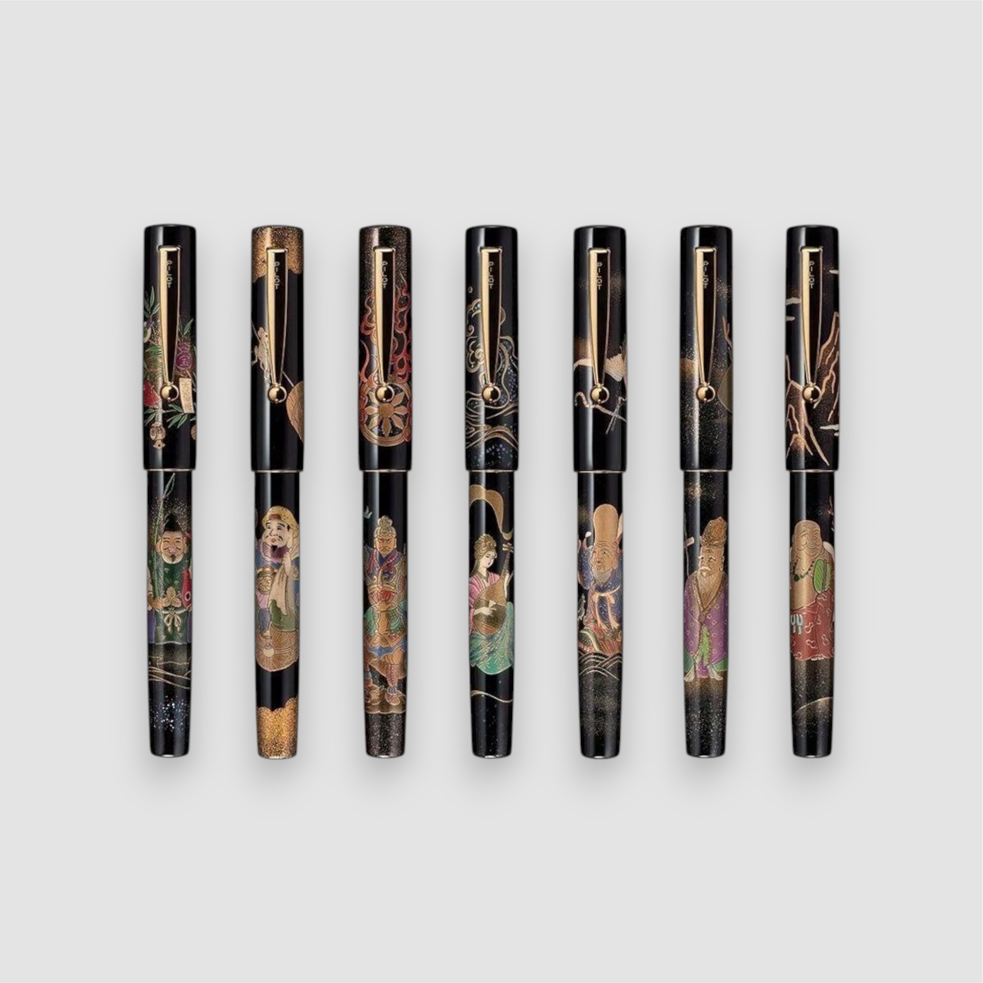
Explore the seven pens
Choose a pen to jump to its story, artist and photographs.
1. Ebisu — prosperity from the sea
Product photographs: PILOT Corporation. Explore the 360° view ↗
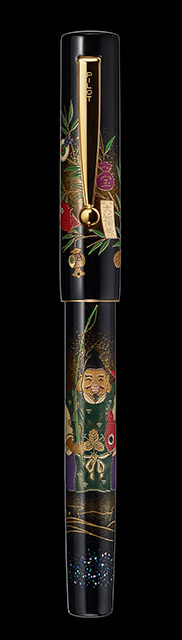
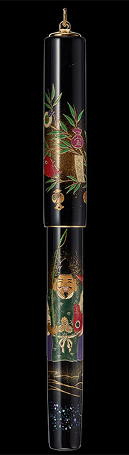
Artist: Hideki Furuhara, signature Shotaku. Ebisu holds a special place among the Seven Gods of Good Fortune because he is the only one whose origins are entirely Japanese. Traditionally associated with fishing and a plentiful catch, his role gradually expanded over time and he became a deity of prosperity, successful business and abundance.
Shotaku depicts him with the attributes that make him immediately recognisable: a red sea bream in his left hand and a fishing rod in his right. Beside him appears fukuzasa, a bamboo branch traditionally associated with commercial prosperity and good fortune. The fish itself is far more important than it might first appear. Tai, the Japanese sea bream, has long been connected with celebrations and auspicious occasions, and even its name is phonetically linked to medetai, a word associated with happiness and good fortune.
What I like about Ebisu is how easily the story can be read even without knowing the deeper religious background of the Seven Gods. The fishing rod, the fish, the bamboo and the surrounding water immediately create a scene of prosperity earned through work and a successful catch. It is perhaps one of the most accessible designs in the entire collection, yet it still contains layers of symbolism that become more interesting the longer you look at it.
Pilot also created a dedicated light-blue anniversary ink for Ebisu, inspired by the sparkling water around the rocks on which he is depicted. This is something worth remembering throughout the collection: the seven inks were not simply colours chosen to match the pens. Each one was taken directly from an element within the artwork, effectively carrying a small piece of the painting onto the page.
2. Daikoku-ten — wealth hidden inside everyday objects
Product photographs: PILOT Corporation. Explore the 360° view ↗
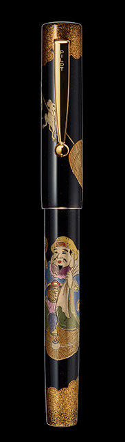
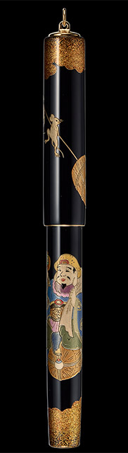
Artist: Mamoru Wakabayashi, signature Mamoru. Daikoku-ten is considerably more complex, both visually and symbolically. Pilot describes his origins through a blending of Hindu, Buddhist and Japanese traditions, linking him to Shiva/Mahesvara and Ōkuninushi. On the pen, however, all of that history is translated into a group of very tangible and easily identifiable objects.
Daikoku sits on bales of rice, carries a large sack on his back and holds the magical uchide no kozuchi mallet in his hand. A mouse appears near his feet, traditionally regarded as one of his messengers. Every one of these details develops the same central idea. In Edo-period Japan, rice was not merely food but also a measure of wealth and status. The sack represents reserves and prosperity, the magical mallet is said to summon good fortune, while the mouse is associated with fertility and abundance.
What makes this pen particularly interesting to me is the way wealth is portrayed. There are no piles of gold, jewels or elaborate treasures. Prosperity is expressed through food, stored resources and fertility. It gives the artwork a completely different understanding of abundance from what we might expect on an object this luxurious.
The dedicated Daikoku-ten anniversary ink was yellow, inspired by the colour of the rice bales on which he sits.
3. Bishamon-ten — the most dramatic of the seven
Product photographs: PILOT Corporation. Explore the 360° view ↗
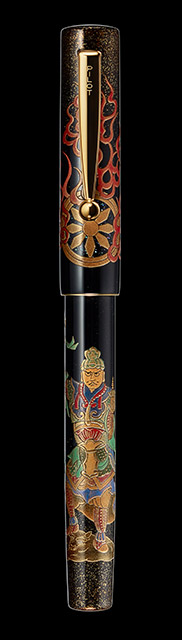
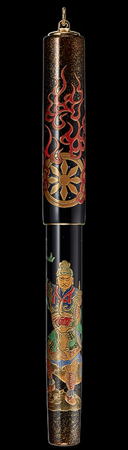
Artist: Masaru Hayashi, signature Masaru. If I had to choose one Seven Gods pen where Togidashi-Taka Maki-e has the greatest opportunity to demonstrate its visual power, it would probably be Bishamon-ten. While many of the other gods appear peaceful, generous or joyful, Bishamon-ten belongs to an entirely different visual world.
He is one of the Buddhist Four Heavenly Kings and is also known as Tamon-ten. With his warrior appearance, he later became strongly associated with protection and warfare in Japan. The artwork immediately reflects that character. Bishamon stands in a powerful fighting pose, crushing a demon beneath his feet, holding a weapon in his right hand and a pagoda or stupa in his left. Behind him is a radiant halo surrounded by flames.
Unlike the calm compositions of Ebisu or Juro-jin, everything here is built around tension, verticality and movement. His armour is particularly suited to the possibilities of maki-e, with gold details, individual sections of armour, ornaments and raised surfaces creating an extraordinary amount of information within an extremely small space. Then there is the contrast between Bishamon and the demon beneath him. It is almost a complete miniature battle scene wrapped around an object barely more than a centimetre wide.
The Bishamon-ten anniversary ink is red, inspired by the flames surrounding the glowing wheel behind the deity.
4. Benzai-ten — where Maki-e meets Raden

Product photographs: PILOT Corporation. Explore the 360° view ↗
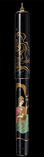
Artist: Yumi Hayashi, signature Yumi. Benzai-ten is the only woman among the Seven Gods of Good Fortune and, for me, one of the most visually fascinating pens in the entire collection. Her origins can be traced back to Saraswati, the Indian goddess of water and rivers, and in Japan she gradually became associated with music, speech, art, wisdom and wealth.
Yumi Hayashi depicts her playing the biwa, a traditional Japanese stringed instrument, holding the instrument in her hands together with the bachi used to play it. Water surrounds the figure, but this is where the artist introduces something that makes the composition particularly special: raden. The waves and splashes of water incorporate extremely thin pieces of iridescent shell embedded into the lacquer.
This is one of the details that I find most important in the entire Seven Gods collection. To my eye, the changing colours of mother-of-pearl create a different effect from the surrounding gold. As the angle changes, the shell can shift between blue, green, pink and silver, making the water appear almost alive. Namiki produces raden by cutting extremely thin layers from the inner surface of shells, placing the pieces into urushi and then repeatedly polishing the surface until everything becomes integrated into the artwork.
For Benzai-ten, the technique could hardly be more appropriate. The element with which she is associated — water — becomes the part of the painting that visually changes the most as the pen moves. It is also one of the clearest examples of why a single product photograph can never fully communicate a high-level maki-e pen. Benzai-ten needs movement and changing light.
Her dedicated anniversary ink was coral pink, inspired by the colour of her kimono.
5. Fuku-roku-ju — an entire story instead of a portrait
Product photographs: PILOT Corporation. Explore the 360° view ↗
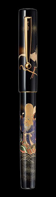
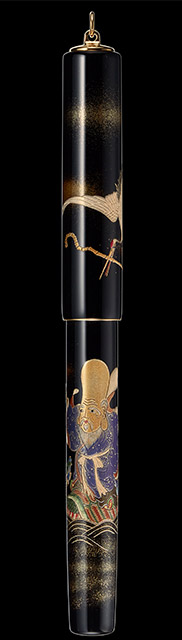
Artist: Masahiro Yamada, signature Masahiro. Fuku-roku-ju comes from Chinese Taoist tradition and is traditionally associated with the Southern Pole Star. Pilot’s Japanese catalogue explains the three characters in his name through blessings of descendants, health and prosperity, and long life.
His appearance is unmistakable, with an exceptionally high forehead, long beard and large earlobes. But Masahiro Yamada does much more than create a traditional portrait of the deity. On the pen, Fuku-roku-ju is shown interacting with his companions, a crane and a turtle, which bring him his staff and scroll while he expresses his gratitude to them.
For me, this completely changes the character of the composition. The crane and turtle are already among the strongest traditional Japanese symbols of longevity, but here they are not simply decorative objects placed beside the god. They actively participate in the scene. The painting therefore becomes a small narrative rather than a collection of isolated symbols.
That is why I consider Fuku-roku-ju one of the most sophisticated compositions in the Seven Gods series. Instead of simply arranging symbols around the deity, Yamada creates a relationship between them and allows the story to unfold around the barrel.
Pilot chose green for the corresponding anniversary ink, inspired by the turtle depicted in the artwork.
6. Juro-jin — longevity without spectacle
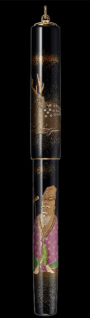
Product photographs: PILOT Corporation. Explore the 360° view ↗
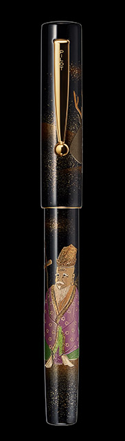
Artist: Seiki Chida, signature Seiki. Juro-jin is another Taoist deity associated with the Southern Pole Star and, above all, with longevity. At first glance, he may seem quite similar to Fuku-roku-ju, but comparing the two pens closely reveals just how differently the artists approached two figures connected with such similar ideas.
While Fuku-roku-ju is built around a more complex narrative, Juro-jin feels significantly calmer. The smiling old man carries a staff with a scroll, wears a kimono decorated with peaches and is accompanied by a deer. Almost every element within the composition points toward the same concept. The peach is a traditional symbol of longevity and immortality, the deer is another symbol of long life, while Juro-jin himself represents the wisdom that comes with age.
Rather than trying to create a dramatic scene, Seiki Chida allows all of these details to work quietly together around a single idea: the peaceful continuity of life. This is also why I think Juro-jin benefits enormously from close-up photography. It may not have the immediate visual drama of Bishamon-ten or the changing raden surfaces of Benzai-ten, but the fine decoration of the kimono and the smaller symbols are precisely what make the composition special.
The dedicated Juro-jin anniversary ink is a light purple inspired by the colour of his clothing.
7. Hotei-son — happiness carried in a bag
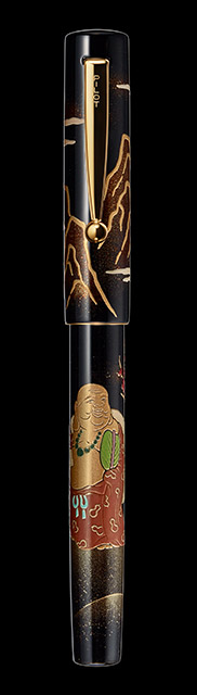
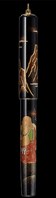
Product photographs: PILOT Corporation. Explore the 360° view ↗
Artist: Misa Seki, signature Misa. The final member of the Seven Gods is Hotei, and he is particularly interesting because, unlike most of the other figures, he is believed to have originated from a real person: an eccentric Chinese Buddhist monk who lived centuries ago and was later regarded as an incarnation of the future Buddha, Maitreya.
His appearance is immediately recognisable: the large belly, the broad smile and, most importantly, the enormous bag carried over his shoulder. Misa Seki places him within a landscape of Chinese mountains, walking with the large sack filled with treasures and blessings. Pilot also points to another interpretation of the bag through the expression kannin-bukuro, which can be translated as the “bag of patience”.
I particularly like the contrast this creates. A god associated with abundance does not carry an ornate treasure chest. He carries a simple sack. And perhaps his most important characteristic is not power or wealth at all, but his smile. In that sense, Hotei closes the Seven Gods collection very differently from Bishamon-ten. One represents strength and victory, while the other is built around contentment, generosity and happiness.
The corresponding anniversary ink is a very dark green-black inspired by the colour of the necklace depicted on the pen.
I am the proud owner of a Hotei-son, and to me it is the most beautiful pen in my collection. I have completely fallen in love with it, but I do not want it to become something that simply sits untouched in a box because of what it is. Quite the opposite. I want to use it, write with it and experience the artwork in exactly the way these pens are meant to be experienced — in the hand, in changing light and over time.
The nib: Mount Fuji at the heart of every pen
With artwork this dominant, it would be very easy to overlook the nib. That would be a mistake, because Pilot created a special nib design specifically for its centenary.
All seven pens use an 18-karat Pilot No. 10 nib in Medium with a special centenary design. Mount Fuji is the central visual element of the anniversary engraving.
The mountain refers directly to an ambition expressed by Pilot’s founders:
“What Fuji is to mountains, PILOT shall be to fountain pens.”
Mount Fuji represented the idea that a Japanese fountain pen could one day achieve the same recognition in its field that Fuji holds among mountains. For its centenary, Pilot brought that idea back and placed the mountain on the nib itself.
I find the symbolism particularly fitting here. The body carries centuries-old Japanese lacquer art, while the nib represents the ambition of a manufacturer founded in 1918. One is rooted in an artistic tradition far older than the company itself; the other represents Pilot’s own industrial history. The two meet in a single fountain pen, separated by a century of development.
Seven inks for seven paintings
The complete presentation set included seven 15 ml anniversary inks; each individually sold pen came with a matching 50 ml bottle. Pilot also offered the inks separately, as a seven-colour 15 ml set and individual 50 ml bottles. What makes them particularly interesting is that every colour was taken directly from a detail within the corresponding artwork rather than simply being chosen as a general colour match.
| God | Ink colour | Inspiration |
|---|---|---|
| Ebisu | Light blue | Sparkling sea around Ebisu |
| Daikoku-ten | Yellow | Rice bales |
| Bishamon-ten | Red | Flames surrounding the halo |
| Benzai-ten | Coral pink | Her kimono |
| Fuku-roku-ju | Green | The turtle |
| Juro-jin | Light purple | His kimono |
| Hotei-son | Black-green | His necklace |
In a way, the inks extend the paintings beyond the pens themselves. A colour taken from a kimono, a turtle, the sea or a flame can leave the surface of the maki-e artwork and appear again on paper. I have written more extensively about Pilot’s Iroshizuku inks, but in the context of the Seven Gods I particularly like the idea that the inks were conceived as part of the visual language of the collection rather than as unrelated accessories.
A rare moment when Pilot and Namiki become almost impossible to separate
There is one more aspect of the Seven Gods collection that is worth explaining, particularly because today we tend to think of Pilot and Namiki as two clearly distinct worlds. Pilot is usually seen as the broader fountain pen manufacturer, while Namiki represents the highest level of its traditional Japanese lacquer and maki-e work. Historically, however, the relationship is far more intertwined.
Pilot itself began as the Namiki Manufacturing Company, and maki-e fountain pens have been part of its identity almost from the beginning. Kokkokai and what we know today as Namiki are continuations of that same tradition, which makes the Seven Gods particularly interesting from a branding perspective as well.
These pens are not simply “Namiki artwork placed on a Pilot anniversary pen”. They are a reminder that Namiki is part of Pilot’s own origins, and that the company’s history of industrial fountain pen manufacturing and its history of Japanese lacquer art were never truly separate stories.
Collection specifications, motifs and ink pairings: Pilot’s Seven Gods catalogue. Artist names and signatures: Pilot’s Kokkokai artist profiles.
Read next

Inside &Liebe: The Japanese Craft Behind Leather Pen Cases
When I see “Made in Japan” somewhere, it immediately has my full attention. I love Japanese culture, its people, and of course the products — which are often made in a way that feels very different from what we are used to outside Japan. One of my favourite brands is andliebe, and I would like..
Read article
A complete overview of all Pilot Iroshizuku inks
Iroshizuku by Pilot is truly a household name in the fountain pen world, and I believe almost every enthusiast is familiar with these inks. I tried my very first Iroshizuku — Ajisai — a long time ago, and my initial experience was actually negative because it feathered heavily on the page. At that time, I..
Read article
Pilot Pen That Stands Out in Any Collection – Pilot Custom Urushi
I recently met with a local pen collector so we could exchange experiences, show each other the pens in our collections, and try them out in person. When he opened his large pen case filled with an impressive selection of Pilots, one pen immediately caught my eye. It was strikingly elegant, standing out from all..
Read article
0 comments
Comments are moderated before publishing, so the conversation stays useful and calm.
No comments yet. You can leave the first note below.